They say a picture is worth a thousand words. HowMuch.net author Raul Amoros proves that the same is apparently true about some some infographics as well.

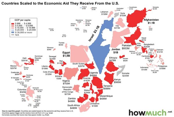
With the US providing approximately $35 billion in economic aid to 142 countries around the world in 2014, Amoros explains that his map is meant to show "the relative size of each country…proportionate to the aid received from the United States," with the color of each country indicating GDP per capita, from dark red ($866-$4,999) to blue ($30,000 or more).
Along with Israel, which received roughly 9% of total US economic aid in 2014, other countries to make the top five include Egypt ($1.5 billion), Afghanistan ($1.1 billion), Jordan ($1 billion), and Pakistan ($933 million).
Amoros also discovered, looking at the US State Department report explaining the US's 2013-2015 foreign aid program, that the entirety of Israel's $3.1 billion in funding was used for military purposes. In Egypt, similarly, a whopping $1.3 of the $1.5 billion total was also used for military-related activities.
In fact, according to the State Department, a full 17%, or $5.9 billion of all US government aid was used to finance foreign military spending, with 24% ($8.4 billion) used toward global health programs, $4.6 billion (13%) for economic assistance, and $2.5 billion (7%) for development assistance.


