'Dishonest to the Point of Misinformation': Federal Reserve Dragged for Odd Defense Spending Graph
21:34 GMT 23.01.2023 (Updated: 11:06 GMT 07.04.2025)
Subscribe
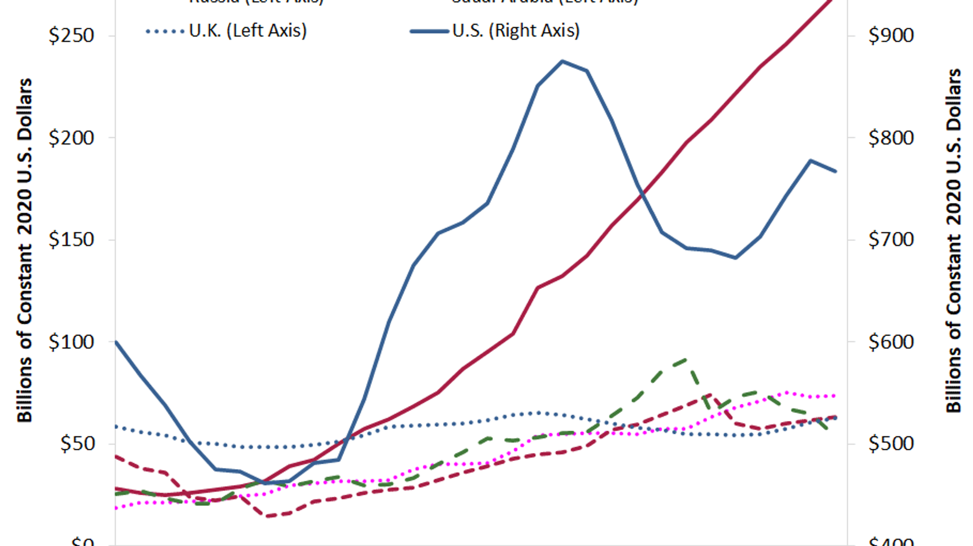
After the St. Louis Federal Reserve tweeted out a highly misleading line graph of several nations’ defense expenditures on Monday, users highlighted its ham-fisted and deceptive nature with both humor and facts.
The tweet linked to a January 3 article about the patterns of defense spending around the world in light of the conflict in Ukraine, highlighting the steady and rapid increase of China’s military budget since the early 1990s.
However, the graph accompanying it, which was included in the tweet, has been modified in an unconventional way: while the spending by five of the nations is measured on the Y-axis on the left side of the graph, as is traditionally the case, for the line representing the United States, the Fed used a bizarre separate Y-axis on the right side of the graph.
As a result, at a glance it seems China’s spending has rocketed far above every other nation’s, including the United States’, when in fact it remains barely one-third of the amount.
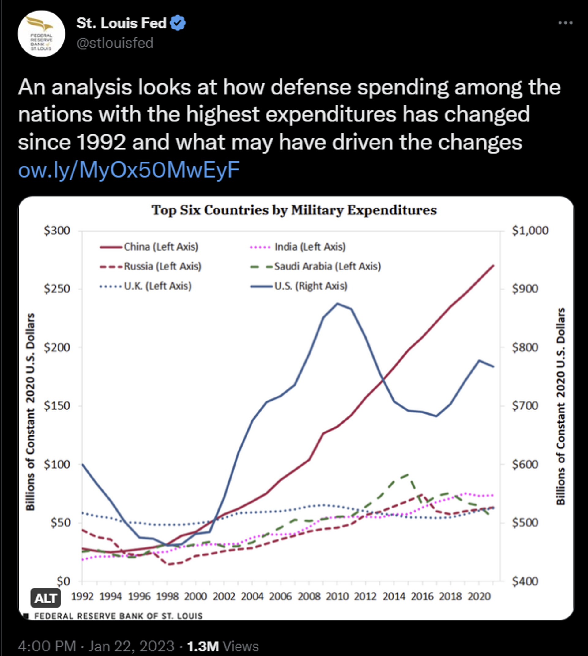
A January 22, 2023, tweet by the St. Louis Federal Reserve with an unusual three-axis graph of defense spending by the top six nations, which places the US on a separate axis from the rest.
© Sputnik Screenshot
As replies poured in denouncing the Fed’s deception, a few users tweeted accurate versions of the graph, if the US’ line had been placed on the same Y-axis scale as the other five nations.
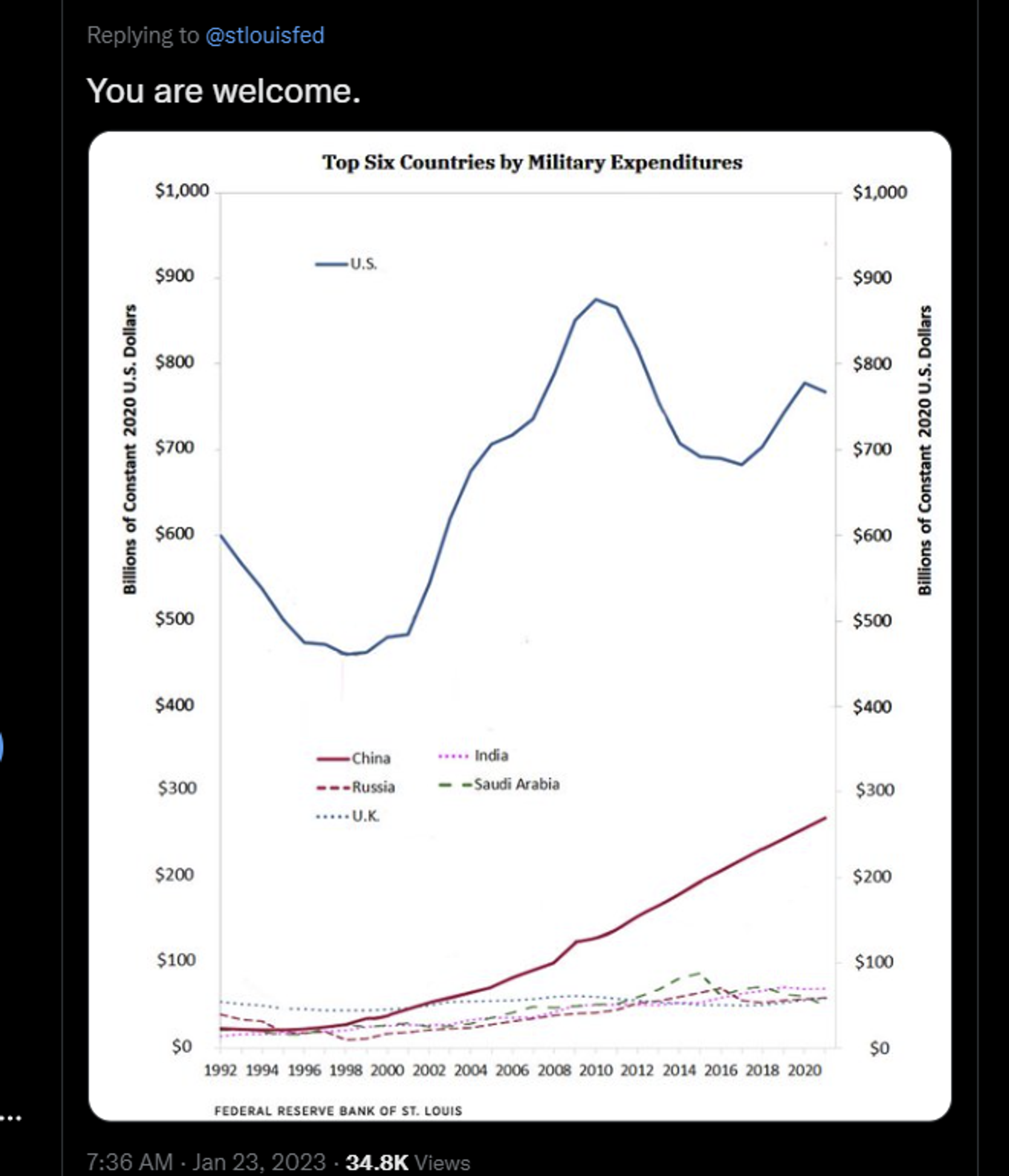
Twitter reaction post
© Sputnik Screenshot
Others tore into the Fed in a more rhetorical way, or simply clowned on the absurdity of the graph.
“If a student made this graph for a statistics 101 class, the teacher would give them an F,” quipped journalist Ben Norton. “But because it involves Washington’s public enemy number one, Beijing, the ‘experts’ at the St. Louis Fed were awarded a Golden Star for service in the New Cold War.”
“Congrats on making the most misleading chart of 2023 so far!” said one user. “This is dishonest to the point of misinformation,” wrote another.
One person joked the situation was another example of “American exceptionalism.”
Someone even dropped an image of the cover of the 1954 book “How to Lie With Statistics” by former tobacco lobbyist Darrel Huff, with the message “I see you've read one of my favorite books.”

Twitter reaction post
© Sputnik Screenshot
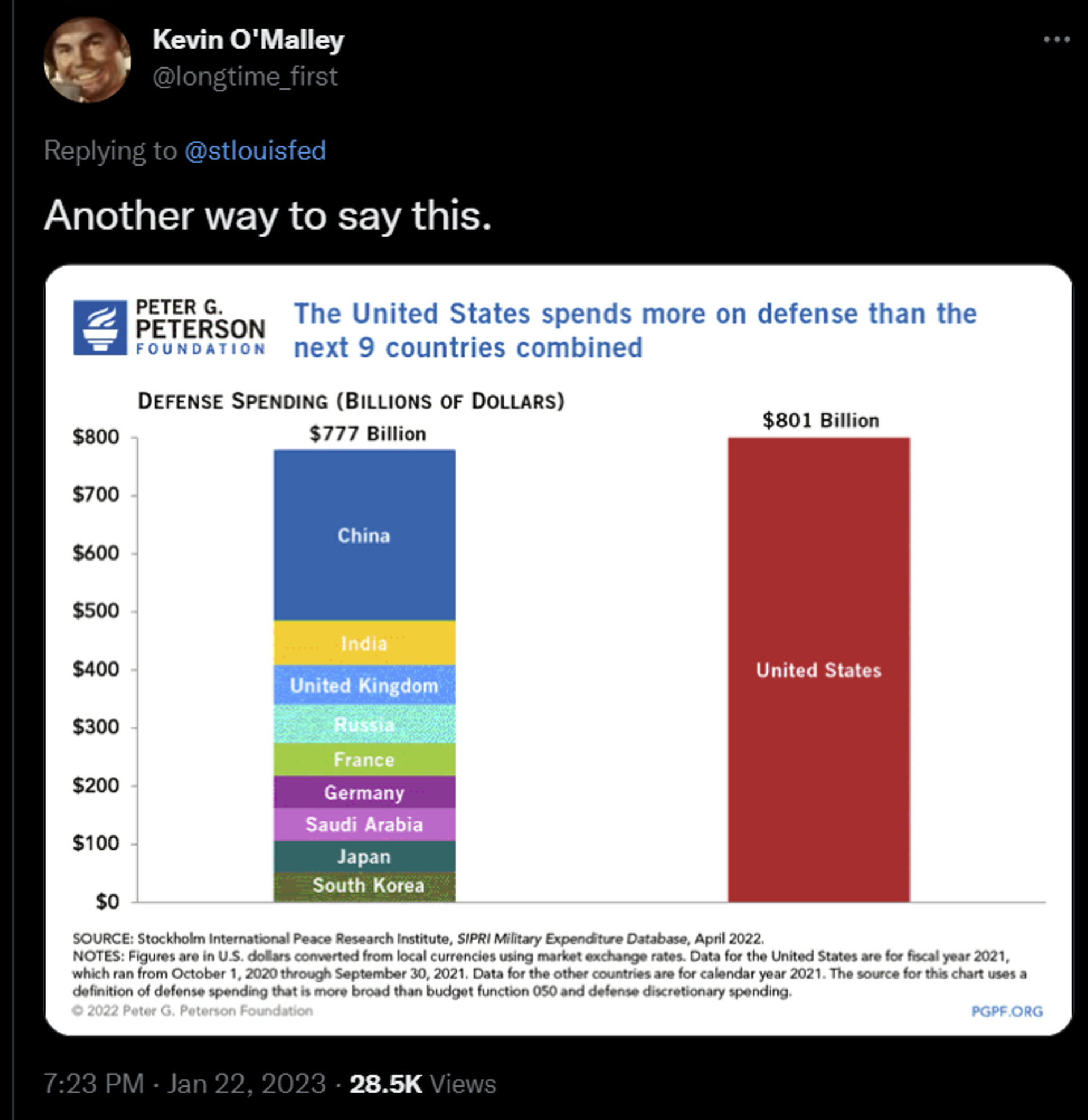
Some dropped other graphs that they felt better illustrated the drama of the difference between US defense spending and that of other nations.
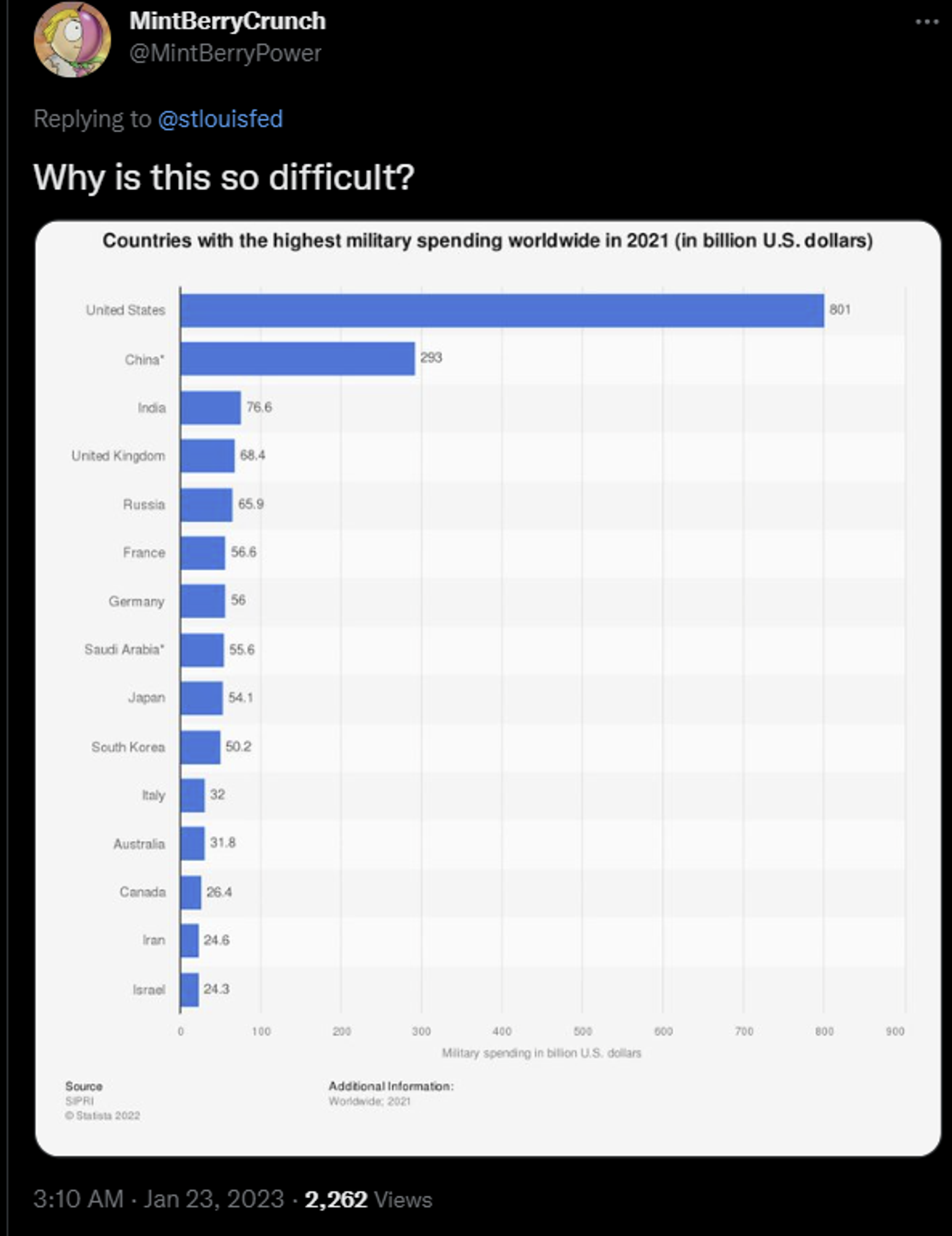
Twitter reaction post
© Sputnik Screenshot
Twitter reaction post
© Sputnik Screenshot
According to the Stockholm International Peace Research Institute (SIPRI), global military spending reached $2.1 trillion in 2021, with the US spending $804 billion of that by itself. By comparison, China spent $293 billion on its military that year. The US spent so much on its military, it spent more than the next nine countries combined, including China.
The most recent Pentagon budget, signed by US President Joe Biden last month, was a whopping $816.7 billion.
